IELTS Writing Task 1 Academic online Course
General Overview
IELTS Academic Writing Task 1 overview-
How to write an introduction to IELTS Writing Task 1 (Academic)?
-
What is an overview of IELTS Writing Task 1 Academic and how to write it?
-
How to Write Body Paragraphs on IELTS Writing Task 1 (Academic)?
- Line GraphLine Graph Samples20 Exams
-
Academic IELTS Writing Task 1 – Line graph sample 1
-
Academic IELTS Writing Task 1 – Line graph sample 2
-
Academic IELTS Writing Task 1 – Line graph sample 3
-
Academic IELTS Writing Task 1 – Line graph sample 4
-
Academic IELTS Writing Task 1 – Line graph sample 5
-
Academic IELTS Writing Task 1 – Line graph sample 6
-
Academic IELTS Writing Task 1 – Line graph sample 7
-
Academic IELTS Writing Task 1 – Line graph sample 8
-
Academic IELTS Writing Task 1 – Line graph sample 9
-
Academic IELTS Writing Task 1 – Line graph sample 10
-
Academic IELTS Writing Task 1 – Line graph sample 11
-
Academic IELTS Writing Task 1 – Line graph sample 12
-
Academic IELTS Writing Task 1 – Line graph sample 13
-
Academic IELTS Writing Task 1 – Line graph sample 14
-
Academic IELTS Writing Task 1 – Line graph sample 15
-
Academic IELTS Writing Task 1 – Line graph sample 16
-
Academic IELTS Writing Task 1 – Line graph sample 17
-
Academic IELTS Writing Task 1 – Line graph sample 18
-
Academic IELTS Writing Task 1 – Line graph sample 19
-
Academic IELTS Writing Task 1 – Line graph sample 20
-
Academic IELTS Writing Task 1 – Line graph sample 1
- Bar ChartsBar Chart Samples10 Exams
-
Academic IELTS Writing Task 1 – Bar chart sample 1
-
Academic IELTS Writing Task 1 – Bar chart sample 2
-
Academic IELTS Writing Task 1 – Bar chart sample 3
-
Academic IELTS Writing Task 1 – Bar chart sample 4
-
Academic IELTS Writing Task 1 – Bar chart sample 5
-
Academic IELTS Writing Task 1 – Bar chart sample 6
-
Academic IELTS Writing Task 1 – Bar chart sample 7
-
Academic IELTS Writing Task 1 – Bar chart sample 8
-
Academic IELTS Writing Task 1 – Bar chart sample 9
-
Academic IELTS Writing Task 1 – Bar chart sample 10
-
Academic IELTS Writing Task 1 – Bar chart sample 1
- PIE CHARTSPie Chart Samples5 Exams
- MapsIELTS Writing Academic Task 1 Maps Samples7 Exams
-
Academic IELTS Writing Task 1 – Map sample 1
-
Academic IELTS Writing Task 1 – Map sample 2
-
Academic IELTS Writing Task 1 – Map sample 3
-
Academic IELTS Writing Task 1 – Map sample 4
-
Academic IELTS Writing Task 1 – Map sample 5
-
Academic IELTS Writing Task 1 – Map sample 6
-
Academic IELTS Writing Task 1 – Map sample 7
-
Academic IELTS Writing Task 1 – Map sample 1
Writing Correction
-
 IELTS Vocabulary Builder book series – part 1
$5.00Original price was: $5.00.$0.00Current price is: $0.00. -
 IELTS Writing Correction service
$8.00 – $22.00
-

IELTS Vocabulary Builder Series
Download IELTS Vocabulary Builder book series for free!

Academic IELTS Writing Task 1 – Line graph sample 1
A new IELTS Academic writing task 1 exam asking to describe a line graph.
You have to write at least 150 words within 20 minutes.
Start Your exam and write your answer in the comment section.
We do not guarantee a free correction of letter, but we will do our best to evaluate it.
Exam Summary
0 of 1 Questions completed
Questions:
Information
You have already completed the exam before. Hence you can not start it again.
Exam is loading…
You must sign in or sign up to start the exam.
You must first complete the following:
Results
Results
0 of 1 Questions answered correctly
Your time:
Time has elapsed
You have reached 0 of 0 point(s), (0)
Earned Point(s): 0 of 0, (0)
0 Essay(s) Pending (Possible Point(s): 0)
Categories
- Not categorized 0%
- 1
- Current
- Review
- Answered
- Correct
- Incorrect
- Question 1 of 1
1. Question
Academic IELTS Writing Task 1 – Line graph sample 1
You should spend about 20 minutes on this task.
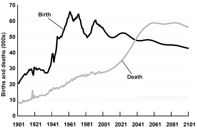
The graph below gives information about changes in the birth and death rates in New Zealand between 1901 and 2101.
Summarise the information by selecting and reporting the main features, and make comparisons where relevant.
Write at least 150 words.
This response will be reviewed and graded after submission.
Grading can be reviewed and adjusted.Grading can be reviewed and adjusted.


This chart illustrates the record and the prediction of how the rate of death and birth inNewZealand changed and will change between 1901 and 2101. From 1901 to 1961, both the birth rate and death rate kept rising.The birth rate has been larger than the death rate for the past 100 years though the birth rate has fluctated. The birth rate showed a rapid increase from 1941, and it reached about 65 births per 1000 persons in 1961, which was the highest point, and after that it started to flactuate intensely until 2001. From 2001, it is expected to decline gradually. However, the rate of the death kept its growth slowly after 1961, and it will shift to a quick rise from 2001. In 2011, it will get higher than the birth rate. After 2031, it will stop going up and remains around 60 deaths per 1000 people until 2101.
In the above graph the birth and death rate of New Zealand is shown from 1901 to 2101. According to which I think the death rate will be increasing in near future as compared to the birth rate.
As from the start the birth rate is greater then the death rate in the early of 1900s.but after the time pass the death rate and birth rate both keep increasing as shown the the graph. but in 1921 the birth rate shows a sudden decrease and death rate increases rapidly but it comes to normal after some time and shows constant but slow increase till the 2021 after that it shows sudden increase as become more as compared to the birth rate till the last of 2101.
when you have a look to the birth rate it shows sudden increase in 1941 and goes on increasing. In the middle of 1961-81 there is a down fall of the birth rate that reached to 50000 and started increasing and reached to 60 again in between 1981-2001. and then it shows the continuous decrease till the end.
In conclution, the graph shows the values starting from birth rate equals to 20 and it reached to it highest of in between 60000 to 70000 and ended up to near 40 and sill be decreasing in the future but the death rate show the opposite it was started from almost 10 and shows the continiuos increases and reached to the final of almost 60 in the future it. but the death rate is always considered to be the lowest in the graph as compared tot he birth rate.